


Sometimes, we are tight with deadlines, and writing long pieces of code is uncomfortable. React Component libraries save you from the hustle and easier the drive to develop the essential features and functionality.
It helps you launch an intuitive, interactive, attractive UI so your users will love downloading and accessing the application and websites.
You can do anything without making many efforts from scratch to finish. You can manage tough and time-consuming tasks efficiently and give your users a better experience.
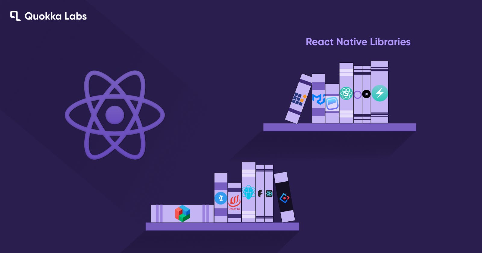
Developer's Favorite React UI component Libraries You Can Practice in 2023
Be it common features or you want to integrate the modern accessibility component, libraries present you with the perfect suite to put it instantly on your project ideas.
It cuts down the efforts and stress of the development phase and improves the efficiency and delivery time with top-notch quality.
We must go through multiple blogs and websites to find the best react component libraries. Here we are wrapping them for your help so you can practice in your next projects.
Top 15 React Component Library Frameworks For App And Website Development
MUI Core
When looking for the react UI component libraries, MUI is the most efficient comprehensive tool to access the advanced features. You can understand its popularity and usability by the following stats.
3.2 million npm download counts npm a week,
78kstars on Github,
17k+ followers on Twitter
2.4k+ open-source contributors support
Aesthticizes the exquisite UI design without compromising control.
Get everything instantly to match the user requirements on priorities.
It contains unparalleled documentation with huge community support. Clear your doubts about its usability and working with this easy-to-understand documentation and grab the best work for react app development.
Ant Design
It contains 50+ components to design the products from scratch. Subsequently, you can access the packages for graphic solutions, data visualization, mobile, etc.
You can access the components code to design the navigation, data entry, data display, feedback, layouts, typography, buttons, icons, etc.
Further, to access advanced design options, subscribe to the pro version. Unleash the potential of other third parties react based components through React hooks Library, react JSON view, etc.
Have an obstacle-secured drive with this stunning React UI component library and balance.
It enriches the product's best features and creates a great productive practice environment at the enterprise level.
Chakra UI
Drive the efficiency, responsiveness, flexibility, and modest accessibility of the react app development Chakra UI. Access this component library's wonderful features and amazing building blocks.
It has achieved a significant base of 10k core contributors and 7.4 Discord members. Moreover, it has collected 19.7k GitHub stars and 1.3M download punches.
If you are a less code lover or want to minimize the development time, stick with this.
Ditch the scratch work and look for smart practice accessing this component library.
It's handy to access and customize all the features to meet client expectations. Utilize and combine all the components elements for a top-notch navigation and interface design.
Here you can flex your capabilities through the optimized color modes on demand.
You will have a hassle-free professional-level developer experience with this tool.
For any considerations and advice, you can get assistance from Chakra's support team; they will resolve all your doubts within 24 hours.
Headless UI
It easily blends with the Tailwind CSS and unwraps the best-featured react libraries for the relevant project needs. Launch beautiful applications using the classes that serve the utility and enhance the HTML work. Another thing that this component library offers is the separate arrangement of visual components and app logic.
It offers extensive accessibility, customization to all the UI components, and transition information to launch suitable app features.
Menus, dialog, radio group, popover, toggle switch, transition, combo box, autocomplete, disclosure, list box, etc. Moreover, you can access the dedicated API and other tools to unleash the best accessibilities.
If you feel miserable or find it hard to practice, get assistance from experienced GitHub community contributors and examples.
It would be best if you punched the regular visits on the discussion page to access the feature requests, general support, and interactions. For further information and assistance, connect with the Tailwind discord server.
Blueprint UI
Be it web applications or desktop apps, Blueprint UI unleashes effective support and real-time practical experience. If you are hunting for the tool to manage complex and highly data-dense UIs, Blueprint can provide you with the best experience. You may have heard about Palantir; the toolkit is developed under the same roof.
It is a tool to launch very well constructive, rich, powerful UIs meeting the client's requirements with the accessibility of 25+ components. Moreover, you can use various design elements to accomplish react app development projects.
You can access real-time compositing, multi-user editing, chaos destruction, pixel streaming, panoramic capture, mixed realities capturing, and magic leaps creation.
You don't have to do anything extra to pass a command to npm for the installation. You don't get any themes here, but you can design a beautiful interface in dark and light modes.
If you are stuck somewhere in the middle of the react app development stack overflow, GitHub repository contributors are open to sharing their knowledge and delivering the needful support.
Grommet
It's a complete package to pull off the themes, modules, responsiveness, and other accessibilities. We should thank HPE for creating a wonderful product to help us. This framework is amazing and effortless to fulfill the desire for comprehensive UI design. It is great as mobile-centric user experience also contains other benefits.
Access an easy-to-personalize grommet theme suite from Grommet designer/ Grommet Theme Designer.
Here, you get an admin panel with a user-friendly interface and tools/library. Any beginner can easily hand on this tool and design the UI effortlessly. Do you know how?-It offers keyboard navigation and screen reader tags and shares compatibility with web content accessibility guidelines.
Grommet facilitates your bold style, completely robust design, and behavior using the components. It satisfies all the versatile needs by giving access to the footers, header, sidebars, grid, lists, texts, heading, and paragraph.
Also, you can enhance the details using color schemes, accents, branding preferences, status, and all.
You can control the UI behavior using the Grommet components by accessing the navigation bars, toggle, menus, and buttons. Additionally, you can define input type style value, media files viewing and other responsive elements, and visualizations.
Find the helping resources by accessing the template library, code sandbox, and storybook.
Semantic UI
Customize the react project with the blend of two mindblowing strategies of React and semantic. Accessible and concise HTML formation drives the developer's attention to this react component library. You can pull off any theme and design UI without any hassle.
Get instant prop validation and other features to build a stunning rich website and application.
It offers instant markup creation and components for buttons, icons, containers, header, footer, and 3000+ theme variables.
No need to start from scratch or ground zero; these jquery free 50+componets will manage your needs for accessibility.
Elements, collections, behaviors, modules, and everything are available to aestheticize the responsive UI design. You will have flexible work experience.
It enables hassle-free debugging, easier to catch and fix issues. You can reuse the UI frequently to accomplish your desires.
Syncfusion React JS UI
You can outreach a global audience for all languages with this component library. It offers the best user experience with a touch-friendly, responsive, and flexible components modules suite.
npm install @syncfusion/ej2-react-calendars –save
Follow this command for installation and configuration accessing the desired packages.
Prime React
It's the trending react component library large corporations and enterprises are working on. GitHub stars, NPM download count, and stack overflow stats showcase its global popularity.
It offers the GUI-enriched theme designer and designs agnostic infrastructure with 500+ variables.
Large corporations and enterprises are relying on it to build their projects. It has 90+ unique components to serve your app development needs.
It also offers template UI blocks(280+) that you can copy and paste as per your preferences and instantly accomplish the goals.
Fluent UI
Many companies have initiated cross-platform and multiplatform projects in their space. Thus, Fluent UI would be the best companion to speed up the development. Microsoft has launched this in the tech market to support developers and UI/ UX designers.
Developers and designers can design intuitive, impressive, and engaging users with beautiful UI creations.
Access the elements and components to fit your creation, targeting the user intent and persona. It is compatible with all devices, PCs, tablets, and laptops.
It's a comfortable, user-friendly, accessible, optimal performance-driven tool. Facilitates complete control over all the components.
Override the style for each element, implementing inline CSS across all platforms. Such as Android, web, windows, iOS, and macOS. Further, it is native to Microsoft. Thus, it is compatible with Microsoft productivity tools.
You can make changes to the code as per your preferences. It doesn't carry any detailed documentation, but it is a great tool for developers and designers. They can accomplish their objective straightforwardly.
Onsen UI
Do you want to develop an application compatible with iOS and Android? OnsenUI is here to deliver auto-styled components for various modern-age platforms like Angular, React, and Vue.js.
No need to access or configure the SDKs' you can initiate the app's production straightforwardly.
It has an easy learning curve with some tutorial assistance without javascript.
Next UI
It's a versatile react component library enriched with wonderful accessibility to align the modern appl and web development needs. It facilitates a rapid, impressive, futuristic, user-centric development experience. Be it beginner or pro; both can have valuable promising component support and offerings. Server-side rendering is another eye-catching factor that makes it a favorite of designers and developers.
Less code, more work with a fully typed, easy learning curve.
Another thing that grabs the attention unwanted style props removal to enhance the tool performance.
Easy to modify and customize the themes and access the desired layout and style. This UI component library incorporates the auto light & dark mode transition.
It offers cross-browser server-side compatibility complying with the WAI-ARIA guidelines and keyboard support.
For additional information and assistance, you can visit Twitter, Discord, or GitHub. Here, you can see the inputs submitted by the community contributors for a better experience with NextUI.
Mantine
It's a react component library to quickly enhance the behavior and functionality of your websites and applications. You can use the help of the 100+ reusable components and 40+hooks to do your job effortlessly.
It is a wonderful package because it's free, handy, and open-source certified with an MIT license. Additionally, it shared the compatibility with known frameworks and inherited the TypeScript conceptualization.
Mantine components are compatible with launching search items, Embla-Carousels, and input components like text, date, radio, navigation, etc.
Free to do magic, experiment with easy-to-customized visual components, and style your UIs for websites and applications.
It offers you flexible theming and customization options. Practice style overriding and go beyond the default theme to enhance the UI designs. You can use visual props, auto vendor prefixing, and critical CSS practice at the time of SSR.
Furthermore, you can integrate the environments with Remix, Vite, create-react-app, Gatsby.js, Next.js, etc.
Theme UI
Have a fascinating experience with this ultimate react-based UI component library. This tool enables you to achieve unique designs for your products and themes with the two main steps.
You can define color and fonts for each theme design.
Get complete control over each component available on your site and application.
ThemUI is perfect for launching custom component libraries, web applications, Gatsby or any other theme, design systems, etc.
Create the new components or use the available 30 built-in components to accomplish an attractive and responsive style for your products.
Access plugins, theming APIs, and dark mode to design static and dynamic websites.
React Virtualized
Working on a complex project with massive data, you should use React Virtualized. It will offer you on-demand customization with all the required components at ease.
It facilitates the rapid and efficient rendering of massive tabular, column, and list formatted data.
Another thing you may be concerned about is standard browser support; it's also on.
When we come to component access and usability, it has a versatile library for all futuristic project management. Like any other component library, you get everything here, but we want to mention some additional ones. Auto-sizer, row-height customizer, direction sorter, cell measurer, arrow-keeper, multi-keeper, etc.
For more, you can explore the GitHub community.
React Bootstrap
Access the components for your need after completing the installation and configuration. It provides a straightforward roadmap to build the UIs enriched with React-Bootstrap styles.
React bootstrap is a globally praised front-end package library containing beautiful, customizable themes, starter kits, and other tools/ resources.
npm install react-bootstrap
Summary:
React frameworks and component libraries efficiently and flexibly serve your website and build react apps. It drives the efficiency of the app build process without writing the code and ditching the scratchwork. Get the resources, components, and community support to manage the react app development projects without delay.